For those hoping this is some kind of Fifty Shades guide, you may as well stop reading now. For those whose mind is cleaner than a kitchen that's had the full Kim and Aggie (remember them?!) treatment, read on!
 |
| If you're not after S&M tips, read on to see how I got my guest bedroom looking sexy. |
We've lived here for just over three years and while the whole house has been nothing but a work in progress, one room I've never gelled with was one of our guest bedrooms. Why? Because of the brown laminate, which I think should be banished to Room 101 for the rest of its days (but that's another story), and the dodgy built in laminate wardrobe. Together, it was very soulless and bland and if it was a person, it would be Nigel in Accounts, head to toe in beige. No matter what I did to it (and believe me, it's had more transformations than Madonna), I still wasn't 100% happy with it.
 |
| I gave them all a good go, but none of these looks were hitting the spot for me. |
If you've followed me on my
Instagram for some time, you'll know that I've tried calm and grey Scandi, botanical bedding, and neon colour pops, but none of those looks made me say 'YES!' and I realised that it wasn't because of the accessories in the room, as they all look fab elsewhere, but because of the room itself.
 |
| White walls, cream laminate wardrobe, brown laminate floor- the combo of nightmares... |
So here's what I did to make my room less drab, more fab and packing a personality, and more importantly, keeping the costs lower than the bar at the Limbo Championship Finals. Oh dear.
PAINT EVERYTHING:
You heard me. Paint. Everything. Paint the floor, walls and wardobes. Don't stop there! Paint the plug sockets, light switches, radiator and paint it all in the same colour for a smart finish. I won't bore you again with how I did my floors, as you can read about that
here and I painted my wardrobes using exactly the same method I used when I
painted my kitchen cupboards, the only difference was that I used Estate Emulsion, not Eggshell this time (thankfully, I had some of this leftover, as I used it on my radiator, after priming. And turning it off, obvs.).
 |
| The difference a lick of paint can make. Have a look at the plug socket behind too- just prime, then paint! |
As my wardrobes have mirrors on them, I taped the edges, so that the primer and paint didn't go near them and I used my trusty 'leftover Carling cans that I couldn't shift at a family BBQ' method when painting the doors to elevate them so that I could paint the edges with a smooth finish, as you definitely don't want any excess paint gathering, unless you don't care if your doors stick together/ or not close cleanly. I didn't paint the insides of the doors and drawers, simply because I felt they didn't need it as they're hardly going to be on display like they are in the kitchen, and they're in a pale brown laminate, that isn't too offensive to view when I'm trying to get a jumper from there.
 |
| I should have shares in Frog Tape. Walls and wardrobes all prepped and ready to paint! |
I was deliberating for ages, and dragged loads of you in to vote on my Stories over Hague Blue and Railings (Hague Blue won every time, FYI), but my gut kept going back to the rich, deep tones of
Railings. I know it's hardly revolutionary, as you can't move on Instagram for the colour, but I wasn't quite looking for the obvious bluey tones of Hague Blue.
 |
| I put a test patch of Hague Blue, Railings and Downpipe on all walls, to see how they reacted with the light. |
For those who the prospect of going to the dark side would be like taking your favourite white shirt and cooking a curry in it with no apron, or those who feel that rooms will be sucked in, fear not! Dark colours add personality where there is none, and enhance personality in spaces which have period features. This is massively cost effective as you'll need to buy more home accessories to do the work for you, rather than just getting a pot of paint and working with what you currently have. I also read in one of my interiors magazines, that darker colours, in fact, draw the eye AWAY, so won't suck the space in, but of course I wouldn't recommend doing this in a room with no windows, otherwise you'll feel like you're in solitary confinement...
 |
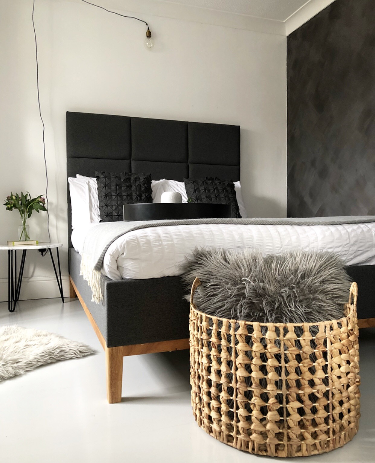
| The bed pops and the eye is taken away with the dark walls. 'Completely Devoted' print from SooUK. Tasseled hand woven cushion from Shiv Martin Textiles. |
I found that by putting a test patch on all walls and seeing how the light makes the colours appear, it gives you a good idea of what it'll look like when it's everywhere. Painting the
floors white also offsets the walls beautifully, so think of other ways you can bring light into your space, as it doesn't always have to be the walls doing all the work.
 |
| White out: before the dark walls happened. |
COMFORT IS KEY:
Just because you don't sleep in your guest bedroom (unless you're in the dog house, obvs), it doesn't mean you put comfort on the back burner. As I'd painted such a dark colour, I had to consider how I'd want to feel if I was to sleep in there as a guest, and cosy was one of them. I added throws, sheepskins and also a feather JuJu hat from
Mink Interiors to the wall to add texture.
 |
| Styling and accessorizing- my fave part of a makeover. Hand painted and distressed Mason jar from Wendy at All That Jarz. |
I was beginning to hate the bed that we picked up for a song in the Dreams sale in 2015, as it just looked so 'meh' against the white wall. Now, it pops against the dark wall and to make it even better, the lovely people at
Emma Mattress got in touch to send me a mattress for the bed. Well, lucky guests, I say!! Firstly, seeing the mattress come out of its rolled vacuum pack, was more satisfying than it should have been, watching it expand slowly and come to life. I slept on it a couple of nights ago, and it honestly felt like I was sleeping on a firm marshmallow in a boutique hotel, thanks to the supportive memory foam, made up of four layers and if you're prone to overheating at night, the top layer of the mattress will regulate humidity. If that's not already sounding bloomin' marvellous,
Emma Mattress give you an 100 night trial and if you're not happy, they'll come and collect it for free and you'll receive a full refund. While that's fantastic, I doubt you'll need to send yours back, especially with a 10 year guarantee and free delivery- what perks! Use the code NEST100 for £100 off a single, double or king
Emma Mattress, the code is valid until April 30th 2018.
 |
| How the Emma Mattress is made up. Pic from Emma website. |
USE YOUR ASSETS:
Whenever I give any room in my house a lift, I always make the most of what I have already, the most obvious reason is that it's a great cost cutting exercise. I love repurposing items, at the moment, I'm all for using old books as decor, they make fab platforms for small plants and trinkets. I also love using scaffold boards for floor boards to balance accessories on, I pick them up for free from my local scaffold yard.
 |
| Add interest by repurposing items. |
I've used this industrial stool from Swoon Editions as a side table, and styled it with a gorgeous stone planter from
Mizzle and Haze and faux eucalyptus from
Fox Flower Shop and upcycled an old lamp from my parents with
Annie Sloan Chalk Paint in Paris Grey.
 |
| Beautiful chalky greys offset perfectly against the dark wall. |
And yes, you probably recognise THAT
rug from La Redoute that went practically viral on Instagram, that used to be in my living room, but adds some coziness up here instead to break up the white floor. Let's not forget that there's nothing crisp white bedding, like this double set gifted to me from
Dreamon UK.
 |
| I wish this was my actual bedroom now! |
If you're planning a room makeover, my top tips are to be brave with colour, be cost effective and think of three adjectives to describe how you want your space to be, and go for it!! Enjoy some more detailed photos, before and after pics and links of where I got some of the fab products from my guest bedroom below!
 |
| Wardrobes and floor before... |
 |
| Bedroom before. |
 |
| Bedroom after. |
 |
| I was going to replace the blingy door knobs, but I quite like them now the wardrobes have had a makeover. Vintage beetroot print from Ink & Drop. Hamlet quote print from Bespoke Verse. |
 |
| Texture and details- can you tell I've got a new phone? |
This blog post was sponsored by Emma Mattress, the opinions are my own, as of course, I would never receive payment for a product that I didn't actually like or wouldn't buy myself.


